Map Critique Module: 1
This week's class was an introduction to Cartography and Map design principles. We covered some basic cartography terms, the early cartographic contributors, the history of mapping practices, the different types of maps throughout history, and the common map design principles.
For this week's lab we were assigned to review and evaluate maps that we could choose. Below are the two maps that I have chosen for my Well-Designed Map and my Poor Designed Map.

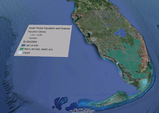
This is my idea of a Well-Designed Map.
Map Synopsis: The title is easily identifiable in the top middle of the layout, the layout has two maps to look at which one includes the top ancestry population for each state which is in the top right corner, and the main map shows all the counties in the US and the highest population of each ancestry county by county. The map legend is in alphabetical order of each ancestry and the other symbol has a footnote to show all the other ancestry's that don't have their own symbol.

This is my idea of a Poorly Designed Map.
Map Synopsis: This map is very messy at first glance and has no title which leaves the reader confused on what they are even looking at. This map is a map of all the hotels in Barcelona. The map only shows one main street and plaza area, leaving the location markers for the hotels in open white space on the map. The only people that may have use for this map would be locals in the Barcelona area that already know where these locations might be. The scale of map should be bigger to include the other hotels on the map that are not on it and have arrows pointing 250m and 300m. The scale bar for map should be smaller as well.


No comments:
Post a Comment