Friday, May 3, 2024

Module 7 Google Earth

 Google Earth


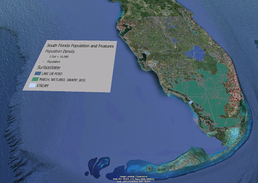
For this week's lab we were tasked with creating a dot density map of south Florida in Google Earth. The map also includes a KML file converted from ArcGIS pro of the different surface water features in south Florida. Above is the map I created. The next task we were assigned to do was record a tour going to multiple cities in south Florida to show the 3D models of buildings. For the recording I assigned place marks to easily hop city to city without dragging map around and zooming in and out. 


Sunday, April 28, 2024

Module 6: Isarithmic Mapping

Isarithmic Mapping


For this week's assignment we were tasked with making a Isarithmic Map using data from USDA & the PRISM group at Oregon State University. PRISM is an analytical model that uses point data and an underlying grid such as a digital elevation model (DEM) or a 30-year climatological average (1981- 2010 average) to generate gridded estimates of monthly and annual precipitation and temperature (as well as other climatic parameters). Grids were modeled on a monthly basis. Annual grids of temperature are produced by averaging the monthly grids and summing for precipitation. The raster dataset provides derived average annual precipitation in inches according to a model using point precipitation data for the 30-year period of 1981-2010. 

I used two different symbolization approaches Continuous & Hypsometric tint. Continuous symbology shows a smooth transition for all values, where each point is shaded with a color tone proportional to the data value at that point instead of breaking the values into range groups. The higher precipitation areas were shaded in blue then slowly progressing to green/yellow for moderate precipitation and then finally red for areas that receive very little rain. There is no breaking the values into ranges and continuously flow one color to the next. Hypsometric tinting is a method used in cartography to indicate elevation. It involves placing colors between contour lines (lines of equal elevation) on a map or for this lab, annual precipitation rates. These colors can be shown as bands in a graduated scheme or applied directly to the contour lines themselves. The map above shows the use of hypsometric tinting being used and is guided with the use of contour lines.

Sunday, April 21, 2024

Module 5 Choropleth & Proportional Symbol Mapping

Choropleth & Proportional Symbol Mapping


 For this assignment we were tasked with making a map showing the population density & wine consumption in Europe. The density map is a choropleth map showing the highest density in red and the lower densities in light orange. The wine consumption map uses graduated symbols to show the counties that consume the most wine. The color scheme I choose was the orange to red color scheme. The lower population densities are in shown in a lighter orange color and the higher populations are a bright red. I believe that this color scheme fits best with the idea of higher dense areas are red indicating a busy area while the lighter orange shows the less crowded and less dense areas. This scheme of orange to red best shows the data highlighting which counties have high density compared to the ones that are in a lighter orange that do not. Using the natural breaks method, I believe that this divides the data in a way to evenly distribute the classes so that one class does not have all the data and still highlights the high and low population countries. I choose the graduated symbols. I felt like it best represented and showed the wine consumption data. Albers projection, this projection is equal area conic projections. It uses equal area to ensure areas on map are accurately represented. This map projection is good for choropleth maps on continental scale because all countries can be seen and aren’t distorted making it easy to find smaller countries and make sure that each color for a country is seen well.

Saturday, April 13, 2024

Data Classification

 Data Classification


For this weeks lab we were tasked with creating a compilation map of Miami Dade using the census data that we were provided with and apply what we had learned in lecture about the four different classifications (Equal Interval, Quantile, Standard Deviation, and Natural Breaks). Above I have created the maps adhering to the map guidelines provided. Top left is the map using Equal Interval Classification which creates classes that all have equal ranges in the data. These range values are determined by dividing the total data range by the number of classes. It highlights the extreme values and clusters a large number of the data into a couple categories. Top right is the map using Natural Breaks Classification which in this classification method, class ranges are determined based on algorithms that attempt to make all values within a class as similar to each other as possible, and also as different as possible to values in other classes. Shows extreme values and clusters large group of values together. The bottom left map is using the Quantile Classification method, which divides the distribution into an equal number of observations. Equally divides the total number of values into the desired number of classes. No classes left empty but leads to a wide range of values in certain categories. The bottom right map is using the Standard Deviation Classification method, which is based divisions of the standard deviation such that the area under the graphed curve is divided into equal sections. This method will put the majority of observations in one class surrounding the average value, while other classes will have fewer and fewer data points as they get farther away from the mean. No gaps in legend to confuse map reader. 

Friday, April 12, 2024

Cartographic Design in ArcGis Pro

Cartographic Design in ArcGis Pro


For Module 3 we were tasked with creating a map of public schools in Ward 7, Washington D.C. using Gestalt's principles of Visual Hierarchy, Contrast, Figure Ground, and Balance. We were given certain guidelines to follow as what we need to include in our map and layout, above is the map I created that has everything that we were tasked to create and includes everything that the guidelines state. For this project I used the clip tool to clip all the schools located in ward 7 so that I could work with that data specifically and then used unique symbols to display the different school levels using different size and color for each level. This is an example of visual hierarchy and contrast. I then messed with the colors of roads to make them easier to to see and clipped the roads that weren't in ward 7 because it would make the map less busy, this is an example of contrast and figure grounding. The inset map and main map are lighter colors making them easily identifiable to the user which is another example of figure grounding. I used the principle of balance at the end by making the map look balanced with as least empty space and good color balance. Title and legend are it's own colors which is another example of visual hierarchy. I added curved text to follow the river since it was the only water feature. Labeled neighborhoods by going into attribute table and choosing the neighbor hood that I wanted to represent certain areas located in Ward 7. 

Saturday, April 6, 2024

Typography

 Module 2: Typography


This is a map that I created to show the major swamps and river systems in Florida. This map also displays the major cities and capitol of Florida. The goals of this assignment were to define and insert essential map element's, label a map in accordance with general typographic guidelines, and employ proper type placement for different feature types (point, line, area). 

The map that I created displays all the major city locations, capital, river systems, and swamps areas in Florida. I have provided the source of data, legend, scale bar for reference, compass, and author of map. 

One of the customizations I did for my map was using themed point symbols for the capital and major cities. I customized labels by using a white outline for major cities, capital, and swamps. I also edited the vertices with the river names to make the fit better and more centered on the rivers. I used a green fill color for swamps, I didn’t change color of rivers I liked the baby blue color they already use, and made all counties a deep blue so rivers were more identifiable.


Saturday, March 23, 2024

Map Critique

Map Critique Module: 1

This week's class was an introduction to Cartography and Map design principles. We covered some basic cartography terms, the early cartographic contributors, the history of mapping practices, the different types of maps throughout history, and the common map design principles. 
For this week's lab we were assigned to review and evaluate maps that we could choose. Below are the two maps that I have chosen for my Well-Designed Map and my Poor Designed Map.

This is my idea of a Well-Designed Map.
Map Synopsis: The title is easily identifiable in the top middle of the layout, the layout has two maps to look at which one includes the top ancestry population for each state which is in the top right corner, and the main map shows all the counties in the US and the highest population of each ancestry county by county. The map legend is in alphabetical order of each ancestry and the other symbol has a footnote to show all the other ancestry's that don't have their own symbol. 

This is my idea of a Poorly Designed Map.
Map Synopsis: This map is very messy at first glance and has no title which leaves the reader confused on what they are even looking at. This map is a map of all the hotels in Barcelona. The map only shows one main street and plaza area, leaving the location markers for the hotels in open white space on the map. The only people that may have use for this map would be locals in the Barcelona area that already know where these locations might be. The scale of map should be bigger to include the other hotels on the map that are not on it and have arrows pointing 250m and 300m. The scale bar for map should be smaller as well.


Saturday, March 16, 2024

 About Brandon Tims

My name is Brandon Tims, and I am a Natural Science major with a minor in GIS. I have had some experience with GIS throughout my time at University of West Florida, such as, all the classes to complete my undergraduate certificate in GIS, and for my internship last semester I completed 28 different courses through ESRI and obtained a certificate of each course upon the completion of each course. I would describe myself as a very ambitious, outgoing, great teammate, and highly motivated to achieve the goals that I set for myself and the goals that I receive from others. I joined the GIS program at the University of West Florida. I loved the first couple of GIS courses I took and loved how you could use maps to show data and tell a story through a map. I hope to gain my undergraduate GIS certificate, add and learn more about ArcGIS tools in the system, and make connections in the department to help me further along in my career job wise or project wise.


Here is a link to a story map I have created to show all of the places I have lived and got to visit in my life currently: https://arcg.is/9zjq10


Sunday, December 3, 2023

GIS Online Portfolio

GIS Online Portfolio 

This assignment I was tasked with making a GIS online portfolio. Using Wix I was able to create my own GIS portfolio Website that the public can view at any time. Please use the link bellow if you would like to visit my Portfolio website! I plan to update it as I get more experience in the GIS field and have some of my own work and projects to add in My work section.

Portfolio link: Home | Brandon Tims Portfolio (btimd1129.wixsite.com)


Sunday, November 19, 2023

GIS Day Family Presentation

GIS Day Family Presentation

For my GIS day I conducted my own event at my house with my family and girlfriend. The event took place in my living room and the format of the event was an informal discussion. The topic for my GIS day event was Carrers in GIS, I felt like I always struggled to explain to people what my degree was and what GIS was, so I took this time to try and explain what GIS is and what careers I could possibly work in or with in my future of pursuing a GIS career. 
GIS Day:
Organizations across the globe are increasingly relying on GIS and location intelligence to make better decisions. As a result, careers in GIS are in demand more than ever. Equipped with data visualization and spatial analysis skills, GIS professionals qualify for occupations in countless fields. Some examples of these fields are Climate Scientist, Conservationist, Forester, GIS Manager, Health Geographer, and app developers. 
-Climate Scientist- The National Climatic Data Center uses the world's largest climate data archive to provide climatological analysis to all sectors of the economy. Using these climate archives allows us to better understand climate and the future change for climate change. In GIS we can use maps to show temperatures of the atmosphere and ocean to better track climate using weather stations on ground but also satellites using thermal imagining. Some other examples of GIS use for climate include drought prediction mapping and tracking ice loss in the arctic region to better predict climate change in the lower atmospheres.
-Conservationist- Conservationist travel the world using data collection and mapping technology to identify and preserve national parks for future generations. Natural ecosystems around the world are beginning to collapse. These ecosystems are losing species, water areas for these animals, and overall, their ecosystem is beginning to collapse due to human encroachment of their land. These ecosystems need to be protected and GIS has been an aid to helping these ecosystems. Conservationist while in the field collect data and using GIS to create maps for the that data begins to show patterns of what is happening in that ecosystem to help the conservationist understand that ecosystem and how to help aid in finding solutions to help the ecosystem out in the future. 
-Forester- Foresters manage the use and development of forests and natural resources, using GIS technology to improve the lands health and productivity. Foresters collect the data for forest areas and using GIS they can collect data from trees in the area and get a better spatial representation of the area that they are working in. GIS can also help the foresters better plan for a management strategy for the area in interest.
-GIS Manager- GIS Managers leverage location technology to plan, assist, and improve their cities. GIS is a combination of maps and technology; it allows people to look at and analyze anything in the world spatially. The power of GIS is the information behind the map such as ownership of land, size of land parcel, soil types, and also determine whether a certain area of property is a good location for a developer. GIS managers can work with multiple organizations in cities to help organizations use GIS in their work to determine better actions to take for their projects.
-Health Geographer- Health Geographers deploy a powerful combination of GIS, remote sensing and GPS technologies to prevent diseases and stop them from spreading. GIS can be used in health to provide hospitals where there are high populations, to plot where diseases begin to contain the spread of certain diseases and deploy counter measures to help these communities who need vaccines or other health measures.  
-App Developer- App Developers and Computer programmers are problem solvers, using coding to build interactive web maps that visually represent geographic data. App developers and computer programmers use geospatial data from GIS programs and turn them into interactive maps using code that the public can use online such as google maps and apple maps or even more specific maps such as what colleges are offering certain majors and narrow the list of colleges down to colleges that specifically offer the major, you're looking for.

This was my GIS day activity I presented to my family, and it has helped me explain better what my career field does and how it interacts with other career fields. I also believe that it showed my family how important this field is to society and how versatile the GIS field can be used and now fully support me in perusing this degree.

Sunday, October 15, 2023

GIS Internship 3

 LinkedIn Profile 

My approach to creating my LinkedIn profile was to treat it as my resume at first and apply everything that I had written down in my resume in each section of LinkedIn. My about section I treated as, what job/internship I am currently looking for and little details about me. I wanted people who look at my profile to be able to easily see what I am looking for but also what skills and abilities I have picked up along the way. In the experience section I filled out all the previous jobs I had worked, description of what I did at each job, and the skills that I used while working at that certain job. The skills section I tried to add as many skills as possible from as small as working independently to certifications I had earned through school. 

I am currently working through my group 2 work but have ran into an issue with ESRI maintenance subscription and it has held me back from completing any further courses. I do plan on turning my mid-semester check-in but I have only completed one model so far because of my issue that I stated above.

Saturday, September 16, 2023

GIS Internship 2

 GIS Job Search Assignment

Some of the key takeaways I had from the GIS job search assignment was that there are some certifications that I should look into getting to improve my ability to acquire a "dream job" position. I need to finish my part 107 UAS certification. Doing this assignment also made me realize just how qualified I am for a lot of these positions posted online and by acquiring a couple more certifications I would be completely qualified to be hired for the position I want a UAS Unmanned Ariel Systems pilot. 

Sunday, September 3, 2023

GIS Internship 1

     This semester I am tasked with finding an internship in the GIS community to further develop my skills and abilities in GIS. As of writing this the teacher advisor for the course Ms. Bloechle is helping me find an internship by emailing people, she knows around the area that might have an available spot for me. Two places she said might be available are the Escambia County GIS Manager and SRC. I have also on my end tried to reach out or find connections to get myself an internship but have had no luck with either no response or they have no positions open/available. As a backup plan in case, I cannot find or acquire and internship, I will join group 2 and work through the virtual campus on ESRI to complete my internship requirements. The GIS user group I was invited to join was the Northwest Florida GIS User Group. I am excited to learn and maybe get involved in the group to further my knowledge in GIS and learn more about the Northwest Florida area.

Monday, June 26, 2023

Module 6: Working with Geometries

 Module 6: Working with Geometries

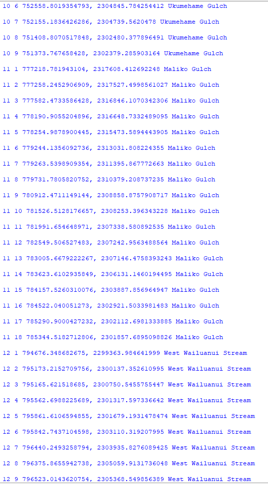
For this weeks lab we were assigned to write a script that creates a TXT file and write to it the coordinates and object IDs for vertices in a shapefile. My script created a new TXT file called rivers_bat33.txt. The script I wrote writes to the txt file, point data for all vertices (0-25 features, total of 247 vertices). Each point has the following information: Feature OID, Vertex ID, X coordinate, Y coordinate, Name of the river feature.

Below are screen shots of the txt file showing all the requirements for the lab showing: Feature OID, Vertex ID, X coordinate, Y coordinate, Name of the river feature.


The flow chart for the script I created is shown below. I don't know if my nested for loop is correct as I didn't know how to correctly show the other outcome.

Notes:
  •  Points, polylines, and polygons are geometry objects. Working with geometry objects and their properties by setting a cursor on shape field of a feature class. You can work with the full geometry object including all its properties such as length area, but you can also use geometry tokens (SHAPE@XY) as shortcuts to specific properties.

  •  Reading geometries can be accomplished using search cursor. Specific approaches are necessary to read the properties of multipart features and polygons with holes.

  •  The spatial reference can be set on cursors to work with geometries in a coordinate system that is different from that of the feature class.


Wednesday, June 21, 2023

Module 5 Assignment: Exploring & Manipulating Data

Module 5: Exploring and Manipulating Data

At the top of image 1 it displays that my code to create the new fGDB file was successful.
The lines after "Iterating over list" is copying the data files to the new fGDB to be used their. The next lines after that begin the cursor search to find cities that have a county seat and their population in 2000. The first 3 cities are listed in image 1 and continue to the bottom of image 3.


I currently do not have a flowchart and plan to finish the last step of lab later this week with Dr. Morgan. (Will update when I have completed.)

Notes:
-Del row needs to be under the loop.
-CreateFileGDB_management creates a new geodatabase
-Search cursors are used to search records and carry out SQL expressions.
-Update cursors are used to make changes to existing records, while insert cursors are used to add new records, delete cursors delete records.


Tuesday, June 6, 2023

Module 4: Geoprocessing

 Module 4: Geoprocessing


The image above displays that my script Mod4_BTims.py is working. The first step the code does is print out the "Adding XY coordinates to the shapefile...", it adds the XY points for the hospitals shapefile. It also prints the messages out from interpreter from when the code started and finishes, using GetMessages(). 
The next line of code executes a buffer analysis on the shapefile hospitalsXYpts.shp. The buffer extends to 1000 meters around the hospitals XY coordinates and also dissolves the hospital buffers into a single-feature layer. This line of code also uses the GetMessages() to get the start and end time of the code from the interpreter.

Process Summary Notes:

-It is recommended to use arcpy.env.workspace instead of from arcpy import env followed by  env.workspace.

-arcpy.<class>.<property>

-arcpy.<toolname>_<toolboxalias>(<parameters>)

-You can use the "\n" character to add a space after each message, making messages easier to read.


Monday, June 5, 2023

Module 3: Debugging and Error Handling


Module 3 Debugging and Error Handling


This image is showing that for the first template of code I have found the two errors in the code and now the code is running. The code prints out the names of each field in the park.shp file.

This image shows the code working for the code template 2. This code had several errors and exceptions that I had to find and adjust the code. One example of the errors I encountered was that the file path that the original code had was looking for the file in the wrong file location and I had to locate where the file was in my files and correct that. This code prints out a list of layers for each data frame in the TravisCountyAustinTx.aprx.


This image shows the code running and working for the code template 3. This code we were told not to fix the errors, rather, we were supposed to use a try-except statement to trap the error and print out the error so that way the code wouldn't crash. The flowchart for how I setup the try-except statement is below to illustrate how the code would work if it encountered an exception or if there were no errors found it would print "Part A Successfully Completed". The code for template 3 prints out an error message in part A stating what the error is, part b prints the name, spatial reference, and scale for three data frames in the TravisCountyAustinTX.aprx.
Notes from this Module:
  • The try-except statement is like the if statement but can be more useful working over errors and handling them.
  • Error messages you receive in python can be very useful in figuring out where your code crashed, as well as, what the error type is. 
  • Using the ArcGIS website to see what useful features are already in python can be used in your code or even see if the feature is spelled wrong or if a letter is case sensitive. 


Wednesday, May 31, 2023

Module 2: Python Fundamentals


Module 2: Python Fundamentals

In the picture above, it shows the code I wrote for this module running and working. The first line displays my last name. The lines under that is a dice game from pre-written code that I had to figure out the two errors in the code in order for the game to work properly. It rolls some dice and lets you know if you win, lose, or tie. 

The list underneath the dice game in the first picture is a randomized list the spits out 20 random numbers between 0 and 10. The flow chart for this code is located in the picture above. The code for this only goes to the first instance of print(luckyList). The rest of the flow chart displays the rest of the code for the last list in the first picture. This code removes a chosen integer (I choose 7) and will print out how many times the chosen number will be removed from the list. It then prints out the new list with the chosen integer removed from the list.

Notes:

1         Import math and random should be at the top of code to work correctly.

2         Indexing is very useful to find certain words or letters in a statement.

3         Breaks can end loops when they reach certain conditions designated in your code.

4         Str(var)+, +str(var)+ is how to add strings to statements that hold variables.


Wednesday, May 24, 2023

Module 1


 The output for 3 radians to degrees is 171.9745222929936 degrees.

My interpretation of Zen python by Tim Peters:
These are the principles of python by Tim Peters. Code needs to be easy to read. Your code needs to be understandable to someone who knows nothing about your program. Don’t overcomplicate your code. Keep your code as simple and readable as possible, even when working with complex problems. Stick to a flat code structure with minimal nesting. It’s preferable to have several easy-to-follow lines of code than a dense one-liner. In Python, there are lots of best practices that make your code more readable for other programmers follow these practices instead of doing it your way. If it’s more practical to solve a problem “your way” and it keeps code readable and easy-to-follow, you may sometimes deviate from established best practices. Deal with errors when they occur rather than letting them silently pass by, not dealing with errors could lead to bigger issues (unless you explicitly silenced the error). Apply critical thinking to understand the problem and then find an appropriate solution. If you can’t explain the implementation of your code to friends or coworkers it’s a bad code and probably over complicated the code. If you can easily explain the implementation of your code to friends and coworkers the code might be good. In Python, you can have isolated namespaces or a collection of names that allow each and every object in your program to have a unique name. Namespaces create a system where names in one of your modules are not conflicting with names in another making them very useful.

Process Summary Notes:
  • CreateModFolders.py script creates 6 module folders each containing sub folders data, script, and results for this class to keep folders organized. (I ran it accidentally before starting the lab and noticed the folders before I started and just figured UWF added them to my folder somehow, but after reading through the lab I realized that it was me.)
  • Print(“hello world”)- to print words you need “__” . 
  • Print (sum)- variables do not need “__”
  •  Flowcharts use certain symbols for each process of your code. 
  • Pi is not known by computer so you must assign its value first before assuming the program knows pi.

Monday, April 10, 2023

Current Land Use Map of Germantown, Maryland


 This map displays the land use classification area for Germantown, Maryland. Over the past 30 years, Maryland’s population has increased by 30% while land consumption has increased by 100% . The City of Germantown wants to follow the Governor’s advice and work toward Maryland’s “Smart, Green and Growing Initiative.” Using the combination of the bands Red: 4, Green: 5, Blue: 6 created the image for the map.
 The class names and color are located under the class names section with the area of each class to the left in acres. The distance image represents the Spectral Euclidean Distance, the brighter a pixel, the greater the difference. Urban/Residential areas are located in pink with an area of 1,999 acres. Agriculture areas are located in cyan with an area of 11,538 acres. Water areas are located in blue with an area of 639 acres. The rest of the classes are located under the class name legend.

Module 7 Google Earth

 Google Earth For this week's lab we were tasked with creating a dot density map of south Florida in Google Earth. The map also includes...